

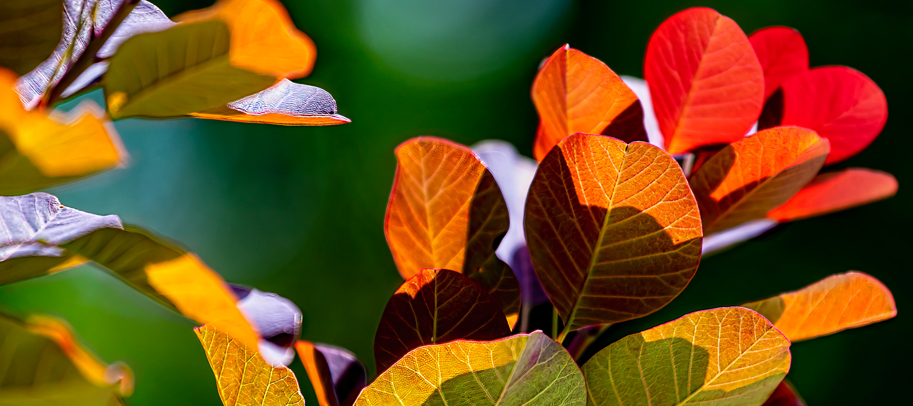
Introduction
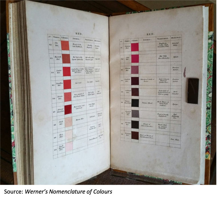
In 1821, a Scottish painter named Patrick Syme published a book of color samples called “Werner’s Nomenclature of Colours: Adapted to Zoology, Botany, Chemistry, Minerology, Anatomy, and the Arts.” Syme’s book was based on a classification system devised by the German mineralogist Abraham Gottlob Werner in the late 18th Century, and a book Werner published in 1814. Charles Darwin used Werner’s system for his scientific observations while developing his theory of natural selection. Werner’s system of classification predated systems such as Pantone (which did not arrive until the 1950s), and it still has relevant lessons for us over two hundred years later.
Animal, Vegetable, or Mineral?
Syme’s version of Werner’s guide was reprinted by the Smithsonian not long ago and made available at an affordable price. (Original copies, if you can find one, sell for thousands of dollars.) The book is only about 80 pages long and has 110 color swatches in the following palettes: Whites (1-8), Greys (9-16), Blacks (17-23), Blues (24-33), Purples (34-44), Greens (45-60), Yellows (61-74), Oranges (72-80), Reds (81-97), and Browns (98-110).
You may be familiar with parlor guessing games like “Twenty Questions” or “Animal, Vegetable, or Mineral,” but did you know that the categories animal, vegetable, and mineral come from a classification system set up by the Swedish biologist and physician Carl Linnaeus in his book, Systema Naturae (1735)? Abraham Werner chose these descriptors as the foundation for his color classification system, applying them to color names to provide familiar examples for identification.
Table 1: Examples of Werner’s Color Descriptions
| # | Palette | Name | Animal | Vegetable | Mineral |
| 1 | Whites | Snow White | Breast of the black-headed Gull | Snow-Drop | Carrara Marble and Carc Sinter |
| 12 | Greys | Greenish Grey | Quill feathers of the Robin | Bark of the Ash Tree | Clay, Slate, Wacke |
| 22 | Blacks | Raven Black | Raven | Berry of Deadly Night-Shade | Oliven Ore. |
| 24 | Blues | Indigo Blue | Throat of Blue Titmouse | Stamina of Single Purple Anemone | Blue Copper Ore. |
| 34 | Purples | Bluish Lilac Purple | Male of the Lebellula Depressa | Blue Lilac | Lepidolite |
| 45 | Greens | Celandine Green | Phalaena Margaritaria | Back of Tussilago Leaves | Beryl |
| 61 | Yellows | Sulphur Yellow | Yellow Parts of large Dragon-Fly | Various coloured Snap dragon | Sulphur |
| 78 | Oranges | Brownish Orange | Eyes of the largest Flesh-Fly | Style of the Orange Lily | Dark Brazilian Topaz |
| 84 | Reds | Vermillion Red | Red Coral | Love Apple | Cinnaber |
| 101 | Browns | Chesnut Brown | Neck and Breast of Red Grouse | Chesnuts | Egyptian Jasper |
Note: Spelling as per Werner’s original.
The numbers, vivid names, and specific examples are displayed alongside square color patches as shown in the Figure below.
Imagine the work that went into the creation of this book! I am sure that the producers of Pantone’s swatch books would sympathize.
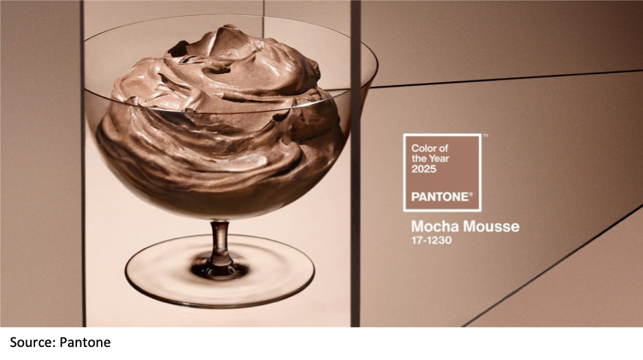
The Color of the Year
Speaking of Pantone, it recently announced that its Color of the Year 2025 is Mocha Mousse (Pantone #17-1230). Paint companies do the same kind of thing. Glidden’s 2025 Color of the Year is “Brick Red,” Benjamin Moore’s is “Cinnamon Slate,” Krylon’s is “Hammered Black,” and so on. There are dozens of them, according to a December 2024 article in Better Homes & Gardens.
In a recent WhatTheyThink video, Frank Romano (President of the Museum of Printing in Haverhill, Massachusetts) commented on Werner’s Nomenclature of Colours and complained that the printing industry has not taken it upon itself to promote its own Color of the Year. Romano has no patience for predictive or hyped colors put out by the companies touting their Colors of the Year for a year that has not happened yet. He would like to see a printing industry Color of the Year that accurately represents the special colors that printers are actually using. He wants printers to report their Pantone (or other special ink use) so that the industry could use that data to promote what really happened during the previous year.
The Bottom Line
Would you do what Frank Romano is suggesting? Romano’s hunch is that the most commonly used special ink might turn out to be gold or silver, Coca-Cola red, or some other corporate brand color. What would be wrong with having cyan, magenta, yellow, or black get the spotlight? After all, the process colors are the true unsung workhorses of this industry.
Contact shannon.wolford@piaservices.org with the color you think should be the 2025 color of the year.
Author bio: Jim Hamilton of Green Harbor Publications is an industry analyst, market researcher, writer, and public speaker. For many years he was Group Director in charge of InfoTrends’ Production Digital Printing & Publishing consulting services. He has a BA in German from Amherst College and a Master’s in Printing Technology from the Rochester Institute of Technology.