Janet Odgis President, Creative Director of Odgis + Co: An award-winning, woman-owned branding firm based in New York City
What is Abstract Visual Language?
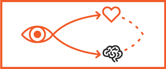
How do you communicate without saying a word? We think visually. The way to our hearts and minds is through our eyes. Seeing and feeling go hand in hand. What we see is so much more powerful than what we read. Because of this, Visual Language is a powerful form of communication that has the ability to influence behavior.
Our ability to think visually begins soon after birth, when babies start to recognize distinct patterns in the world around them. Such familiarity and connection makes this form of identification an especially powerful tool. For centuries, it has formed the backbone of communication and behavioral influence, especially during eras in which relatively few people could read.
Why is This Important?
Symbols, images and patterns make up Visual Language. We know that certain visual cues will make an audience react in visceral ways. Because these cues or representations spark instant understanding and connection, they plunge the viewer right into emotion.
What makes a Visual Language effective, especially in a world in which our brains instantly dismiss so much? Our eye tends to gloss over environments that are too organized. When we see elements that are dynamic and in motion, on the other hand, we take notice; we may even feel uncomfortable. That’s the dynamic tension from which memorable Visual Languages derive their energy.
Your Subconscious Reacts
We see, then feel and respond physically. We filter our feelings through our experiences. We act and react based in some part on reality, and partly on learned patterns of behavior. We pay attention when something less familiar comes into our consciousness, something that is not resolved.
The combination of familiar patterns and symbols within a dynamic composition grabs your attention. It suggests a question while asking us to resolve or finish the story. By setting the view slightly off balance you create a dynamic tension. With this tension you now have the viewer’s attention. Once you isolate the source of tension, you’re on the road to figuring out what makes this particular language an effective one. How can you use this? Let me count the ways.
The History
Abstract Visual Language was utilized during the Russian revolution to get the attention of the illiterate for the purpose of political propaganda. It relied upon images combined with very few words to communicate ideas.
In 1920s Russia, the philosophy of Constructivism emerged in art and architectural circles. As a Visual Language, Constructivism embraces asymmetrical balance, along with geometric reduction and simplified palettes. In its origins as ‘art in the service of the Revolution,’ it combines assorted mechanical objects into abstract structural forms.
Within a few years of its creation, Constructivism was adapted by Bauhaus into the latter’s new world paradigm. A design movement based in Germany, Bauhaus centered on geometric purity and an emphasis on form fitting function. The paradigm influenced the emergence of Modernism, as well as the Swiss Stylevisual language.
Another related movement that came out of this is The International Style, which had a profound influence on graphic design as a part of the Modernist movement, impacting many design-related fields such as architecture and art. Its values of cleanliness, readability and objectivity are readily visible in the design, architecture, and products of the modern world.
Influenced heavily by Russia and Germany, Swiss Style—which also emphasizes simplicity and objectivity—achieved its own fame in the 1950s, driven by designers in Switzerland. Key figures in the movement included Josef Müller-Brockmann at the Zurich School of Arts and Crafts, along with Armin Hofmann at the Basel School of Design. The elements of Swiss Style, including the use of a grid as a framework for organizing design, would go on to have a sizable impact on the development of graphic design in the mid-20th century.
Swiss Style also emphasizes asymmetrical balance, a distinctive use of negative space that creates dynamic tension, which engages the viewer. A simple example is the difference between the Gutenberg Bible (symmetry), which is equally balanced on both sides, and a Mondrian painting (asymmetry), in which order is established from unlike forms composed in space. Attention is paid to the edges of the composition, and how forms enter and exit on all sides.
New Swiss design acknowledges the grid and plays with deconstructing it to create a dynamic tension. Using line, shape, color and typography, the posters and books demand to be seen and considered. Modern Swiss, for example, is a little quirky, but ultimately subtle in its rule-breaking; these designers play with typography and composition. A Visual Language these days isn’t afraid to push boundaries, while still recalling what made its previous iterations so powerful.
All of these styles are examples of the use of Visual Language that connects with the viewer in a way that words could not. They work on a deeper intuitive emotional level. We have only scratched the surface on what is possible in creating an experience.
Janet Odgis is the President and Creative Director of Odgis + Co, an award-winning certified woman-owned design firm based in New York City. For 30 years she has worked with some of the world’s most prestigious corporations reinventing ways to define and express their brand. We Make Business Beautiful.


