

The wannabe
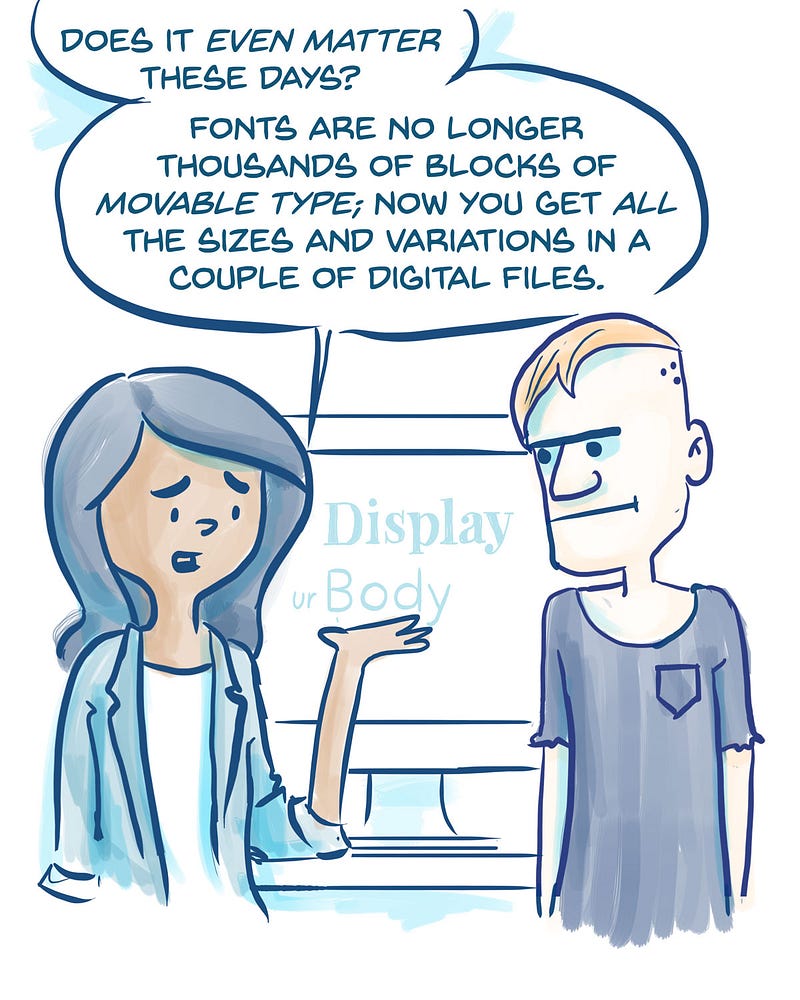
Back in 2014, I was a graphic designer who had just moved to San Francisco to become a UX designer. Before that, I had worked with different multinational conglomerates (well, more like dive bars, failing cafes, and the occasional garage band), and I felt ready to change things up by working in a Bay Area startup. I knew how to lay out elements in artsy posters and combine typefaces on epic displays — how different could it be to work on a web application?
It was pretty different! I soon realized that all the practices that I’d learned designing for edgy artists and businesses didn’t fly with web product design. Combining the Top 20 Trendiest Hipster Fonts of 2013 may have worked for a poster in a coffee shop, but it failed hard on a commercial website that needs to load fast, be legible on a screen, and look beautiful.
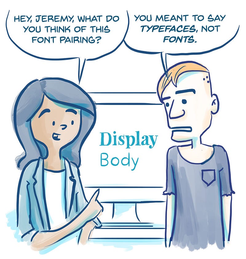
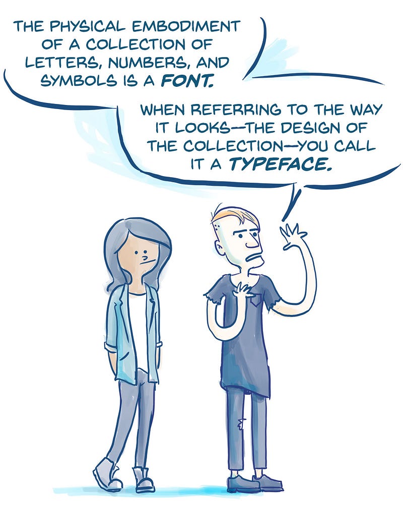
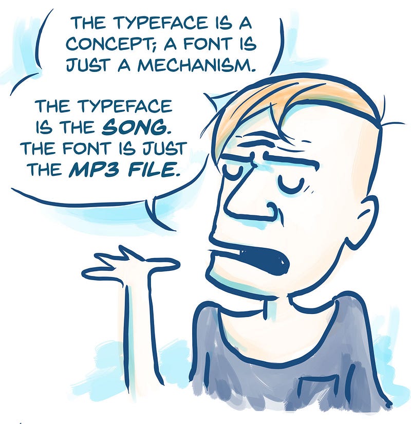
While learning more about UX design, I found myself particularly intrigued by typography. I fell in love with geometric sans-serif typefaces, and neoclassical serifs. A web app’s typeface can set the personality of your product and affect people’s overall experience. The more I learned about the nuances of the craft, though, the more I found myself behaving like a Jerky McJerkface; correcting people on unnecessarily long lines, their improper use of em dashes, and the important difference between fonts and typefaces. Gosh!
Six tips for better typography
After reading extensively on typography, and seeing what works (IRL), I developed the following list of guidelines that have consistently helped me with typographic design. Hopefully, you can apply these tips to start improving the your own typographic design process — without turning you into a snob.
- Start by choosing a typeface for your body text.
- Avoid using more than two typefaces.
- Balance line spacing and font size.
- Keep your line length around 45–90 characters.
- Use a modular scale.
- Pay special attention to proper punctuation.
1. Start by choosing a typeface for your body text.
Always start by selecting a typeface for your body text. It will influence the decisions of any other typeface like headlines and labels. The look and feel of your body text will have the greatest impact on the typographic quality of your design.
There are four main categories of typefaces to choose from: serif, sans-serifs, script, and decorative (I’ll leave discussion of the many subcategories to interested type nerds). For a better readability on product design, it’s better to simply to use a serif or a sans-serif typeface on body text; use decorative or display typefaces sparingly, such as on headlines and short copy.
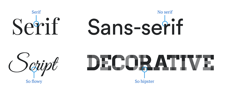
Serif typefaces got that name because of the small lines attached to the end of a stroke in a letter. Most traditional publications like books, newspapers, and magazines use serif typefaces for body text.
Sans-serif typefaces are the ones that lack serif details. They often appear more modern than serifs. Sans-serifs used to be the preferred choice for web design because they rendered better on low-resolution screens. Today, screens have higher resolutions and serif fonts look just as good.
It’s more important to know which sans-serif or serif typeface work better for body text, here are some tips on choosing a good one.
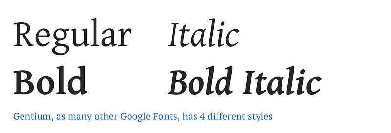
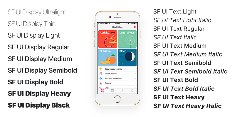
Pick a typeface that has at least four styles.
When choosing a font, a quick way to narrow down your options is by filtering down to the ones that at least have a regular, an italic, a bold, and a bold italic style. Some typefaces have a range of weights from 100–900 which give you way more flexibility in your design. Oh, and when I say italic, I mean true italics, not just slanted text.
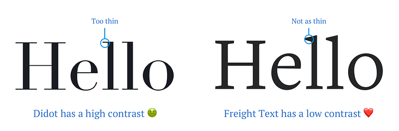
Choose a typeface with a low stroke contrast.
Stroke contrast is the change of stroke width in a typeface. Some typefaces, like Didot, have a higher contrast, meaning the width in some parts of the letters are way wider than in others. Typefaces with higher stroke contrast can work great for headlines, but usually don’t work as well for smaller body text, where thin lines disappear and leave text unreadable. For body text, use a typeface that has a more consistent width — a low stroke contrast.
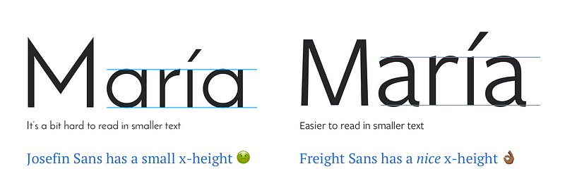
Pick a typeface with a balanced x-height.
The x-height is determined by the height of the letter x and is used more loosely to refer to the height of lowercase characters. You want your body text to use a typeface with a balanced x-height to be legible on screens. If the x-height is too low, the caps will appear too big. If it’s too high, then you won’t be able to distinguish between caps and lowercase — or even worse, it could make your text appear to be shouting.
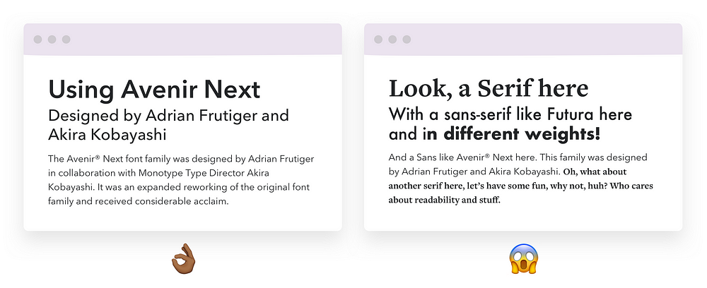
2. Avoid using more than two typefaces.
Now that you’ve chosen a single typeface for your body text, you’re ready to get all creative and combine it with different ones, right? Well, this is when things can get pretty crazy, so here is my advice.
Play with the styles.
Modern web typefaces often come with many different styles, which means they come in different weights or they might even have unique styles for body and display copy. A good example is the San Francisco Typeface from Apple. Typefaces with a larger range of styles and weights can help you differentiate text in special contexts, like a button, in just the right way — making it more affordable but not too heavy. They can also help you balance color (the perceived intensity) across the different sizes of your text (e.g., body text set at a regular weight and headlines at a lighter weight).

Mix from the same super family.
Oh, you still want to combine typefaces? Luckily for you, there’s a bullet-proof solution for you. Some type families come with both serif and sans-serif faces. Because they were designed to play well together, when you mix them, there’s less of a chance for them to end up looking weird. Here are some examples:
- Source Serif Pro and Source Sans Pro (free!)
- PT Serif and PT Sans (also free!)
- Droid Serif and Droid Sans (OMG, Free!)
You seriously want to mix typefaces.
If you’re determined to combine different typefaces, then you might consider pairing them by similarity or by contrast. Pairings tend to work best when there’s an obvious relationship between the x-height, contrast, width, or mood. I would recommend not mixing more than two typefaces unless you feel truly confident. In the end, trust your gut and break the rules while having fun creating harmonious pairings.
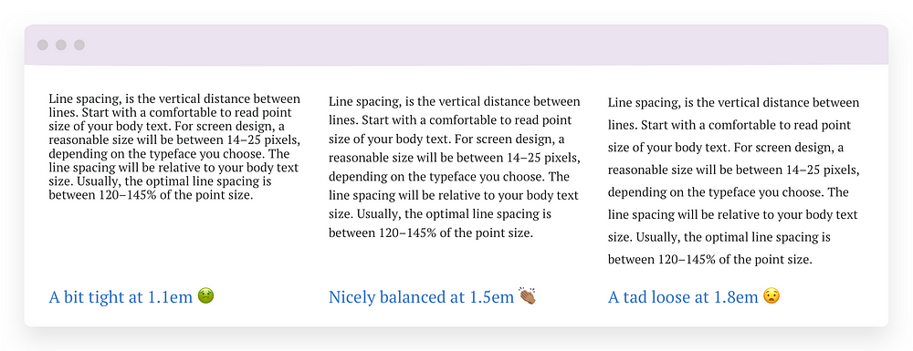
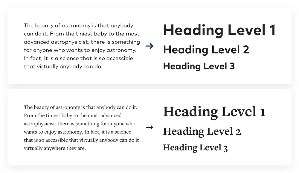
3. Balance line spacing and font size.
The main factors that will influence the readability of your product are a good balance between font size and line spacing. Line spacing is the vertical distance between lines. Start with a comfortable font size for your body text. For screen design, a reasonable size will be between 14–25 pixels, depending on the typeface you choose. The line spacing will be relative to your body text size. Usually, the optimal line spacing is between 120–155% of the font size.
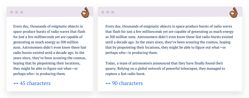
4. Keep your line length around 45–90 characters.
Line length is the horizontal distance of a block of text. Long lines are probably one of the most common design problems on the web. A good line length should be between 45 and 90 characters, including spaces. Shorter lines will make a big difference in the legibility of your design since they’re more comfortable to read than longer lines. As line length increases, people’s eyes have to travel further from the end of one line to the start of the next, which make it harder to track their progress and can be fatiguing (although it makes for great neck exercising).
According to The Elements of Typographic Style, “a 66-character line is widely regarded as ideal. For multiple column work, a better average is 40 to 50 characters.”
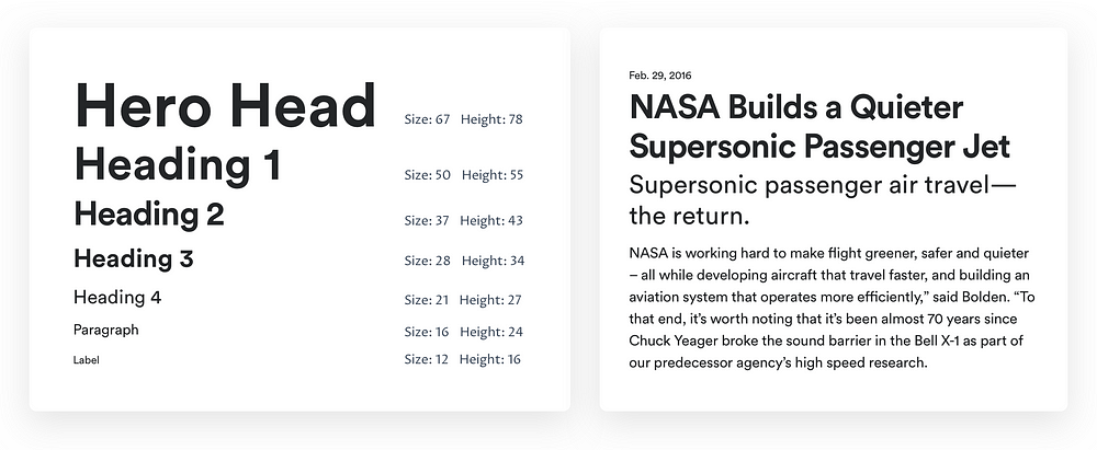
5. Use a modular scale.
Ok, you’ve chosen a beautiful typeface and have worked to make your text easier to read. Now you might be wondering at what sizes should you set your type. Well, a modular scale is the best way to determine your typographic sizes and even the proportions of your whole layout.
A modular scale is a sequence of values that can be applied to determine the size of your text styles in a harmonious way. Applying it can be daunting, but it’s pretty simple. You first choose a ratio, for example, the golden mean 1:1.618 (because you’re an edgy, artsy designer). Then you pick the base size of your text, for example, 16px. After that, you multiply to get the sequential numbers: 16px, 26px, 42px, 68px, 110px.
If you’re like me and suck at math, then you could use a tool like Gridloverwhere you can play with different scale ratios, and it even gives you the CSS and HTML.
I also made a starter Sketch file where I use an augmented fourth scale, and I combine Cormorant Garamond & Proza Libre. Download the file here. I’m so damn nice