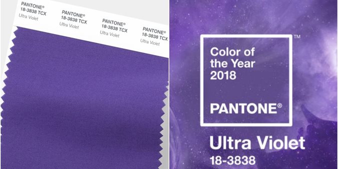
Ultra Violet has been announced as the Colour of the Year for 2018 by Pantone, the global authority on colour.
Ultraviolet is a shade of purple that has come to connote mystery and intrigue, power and passion. It is associated with emblems of royalty and advances in technology, as well as cosmic mysteries and accounts of self-actualisation.
For these reasons, the Pantone Color Institute, which is generally recognised as the global authority on colour trends, has named Shade 18-3838 Ultra Violet as its colour of the year for 2018.
Pantone cites this choice as a representation of the needs of the hour. “We are living in a time that requires inventiveness and imagination. Pantone 18-3838 Ultra Violet [is] a blue-based purple. From exploring new technologies and the greater galaxy, to artistic expression and spiritual reflection, intuitive ultraviolet lights the way to what is yet to come,” commented the institute’s executive director Leatrice Eiseman.
Pantone’s shade of the year is based on its analysis of pop culture, fashion trends and sporting events, as well as popular travel spots, offerings from the entertainment industry and the latest technologies. The colour purple, in its many jaunty forms, has raised its head on runways and red carpets this year, from Amal Clooney’s lilac gown at the Venice Film Festival to a goth-inspired look with a mauve-coloured bust on Moschino’s spring 2018 runway.
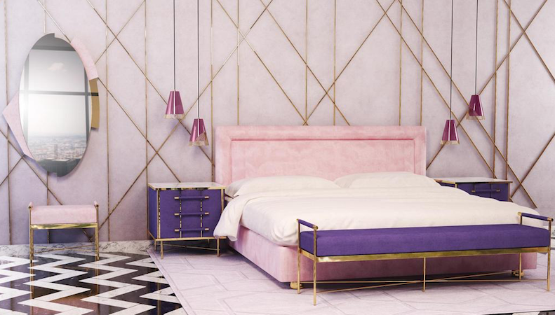
Pantone unveiled a shade of purple in August, in honour of musician Prince who, along with David Bowie and Jimi Hendrix, catapulted the colour to the forefront of pop culture. The hue has also been a popular choice for home decor, as it lends itself well to statement walls and one-off pieces: think a purple couch against a stark white wall.
In hospitality, we are seeing purples like Ultra Violet take centre stage in interior spaces as large and small hotels harness colour and design to entice travellers and stay relevant.
“Ultraviolet communicates originality, ingenuity and visionary thinking,” says Eiseman. “It’s also the most complex of all colours because it takes two shades that are seemingly diametrically opposed – blue and red – and brings them together to create something new.”
Novelty is obviously highly valued at Pantone, which has partnered with Saatchi Art gallery to create a limited-edition collection of Pantone Colour of the Year 2018 prints, which will include specially commissioned paintings, sculptures and snapshots available online from Saatchiart.com from January 1.
The company has also collaborated with Adobe Stock for a curated collection of more than 100 million visual assets that pay homage to the shade. In another first, next year will see the launch of the Pantone Colour of the Year 2018 Formula Guide and Fashion, Home + Interiors Color Guide.
These collector’s items will enable designers and colour aficionados to integrate ultraviolet into their home and work lives and will feature a specialised Color of the Year cover with information on Pantone’s Ultra Violet enclosed within.
Thank you FESPA, for the content of this article.