
You could call it a comeback. After dominating design in the ’90s and early 2000s, gradients took a backseat to flat design elements. But as companies adopted UX/UI design practices, gradients returned as a way to enhance usability. Designers have picked up the ball and are running with it – they’re experimenting with gradients in new ways to add depth and interest to their work.
To understand the resurgence of gradients, start with flat 1.0
To get an idea of where gradients fit within the larger context of current design trends, you need to understand the evolution of flat design. Beginning in the early 2010s, design moved towards simpler color schemes and flat designs to simplify user interfaces, a trend known as flat 1.0.
As with all trends, flat design has evolved to incorporate some of the elements that it originally departed from. Among those elements is the use of more colors, shadows, and depth, and yes, gradients. This new approach is called flat 2.0.
Using gradients to improve UX/UI
Because intuitive functionality is a keystone of UX/UI design, gradients can cue users to interactive elements on a page or app. With flat 1.0, critical usability elements were lost. Designers had to rely on contextual cues, text, or shapes to signify clickable elements on a page.
Gradients allow you to make design elements look tactile and clickable. They add dimension to call-to-action buttons and app icons. For that reason, they’ve become ubiquitous in app and website design.
Gradients in packaging design
Gradients aren’t just popular online. Offline, packaging designers are using them to make products stand out to distracted consumers. Gradients, especially with bright colors (https://99designs.com/blog/trends/packaging-design-trends-2019/#gradients), are popping up on shelves everywhere. In many cases, the gradient itself is the eye-catching element of the design, with simple understated typography to balance out the entire aesthetic.
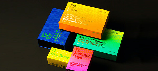 Electric gradients via Christopher Stanko
Gradients in logo design
Gradients are making a comeback everywhere, including logo design. Unsurprisingly, tech companies are leading the charge, with Instagram being one of the most talked about designs. Since so many companies do business primarily online, they don’t have to worry about the limitations that come with printing gradients.
![]() Instagram logo
Instagram logo
3 gradient design tools to try
Try these gradient design tools to get inspiration for your next project:
Eggradients lets you pick colors for your website background. And the egg-shaped gradients and quirky names add a little fun to the process.
For a curated collection of gradients, check out Webgradients. This set of 180 gradients was hand-picked by a team of designers and is ready for you to use.
CSS Gradient is a website dedicated to all things gradients. Use this site to generate CSS code for any color combination you choose.
How to use gradients well in 2020
1. Make sure a gradient is right for the brand and medium
If everyone jumps on the gradients bandwagon again just because they’re on trend, it’s like the ’90s all over again. The key to using them well is to use them thoughtfully. In logo design, gradients give a sense of innovation and adaptability. That may not be appropriate for the logo of a 65-year-old accounting firm. But, that same accounting firm may use monochromatic gradients to add color overlays to its website images. Used subtly, those overlays convey a sense of modern sophistication.
2. Go muted
Combine two of the hottest design trends of the year and create gradients with muted color palettes. Muted palettes still allow you to use a wide range of colors, but they also enable you to make other design elements the focal point. Adding a gradient (like with the new Apple Card) can give your design a fresh, eye-catching look without being too loud.
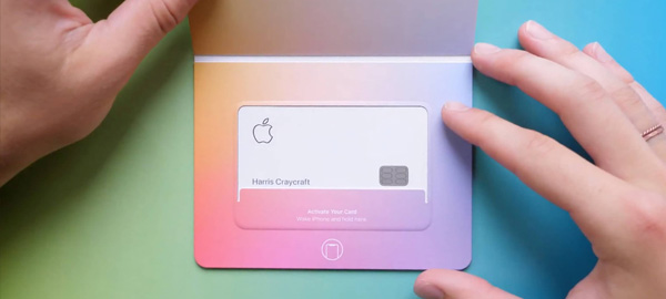 Apple Card. Photo credit: iDB
3. Take inspiration from the natural world
In the real world, we rarely see flat colors. We’re drawn to gradients because they reflect what we experience naturally. If you’re having a hard time finding the right colors for a gradient design, look at the colors of things you find in nature. Seashells, flowers, landscapes, and even animals can all provide inspiration that leads to a beautiful design.
Even as trends ebb and flow, gradients appear to be taking their place as an established design element, and not a passing fad. As designers continue to innovate, expect to see more sophisticated usage of gradients on both digital and print designs.