Cat is not “cat,” it’s c-a-t.
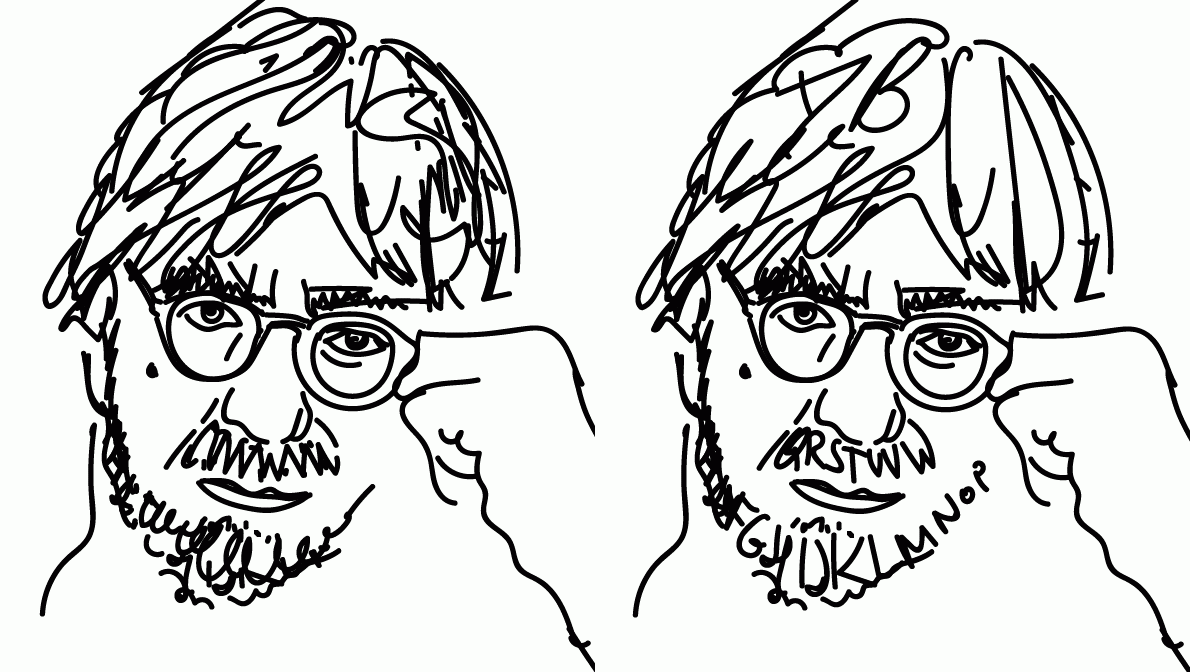
Have you ever fallen in love with a word? Not for its meaning or the way it rolls off your tongue. Not for the idea it communicates or the vision it summons. How about for the way the letters, laid out before you, greet your eyes? The way W cozies up to O which leads into R and ends sharply with a D. Word.
Alan Peckolick most certainly has. In fact, he’s dedicated his life to what he calls his “naive love of letterform,” by which he means, love without particular logic or reason. Now 75 years old, Peckolick is one of the great icons of American typography — the art and technique of arranging type.
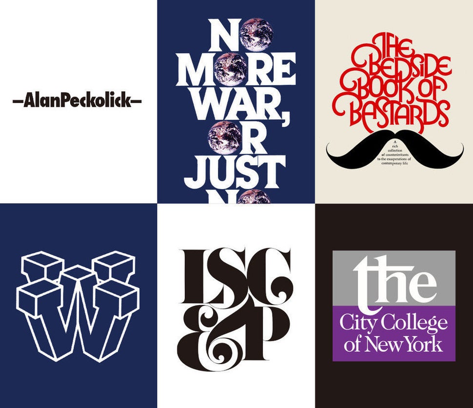
The task of a typographer involves, on a technical level, determining line length, line spacing, letter spacing and point size. The heart of the matter, however, is the hefty task of making letters speak, and sometimes scream, expressing concepts and feelings through a certain combination of serifs and strokes.
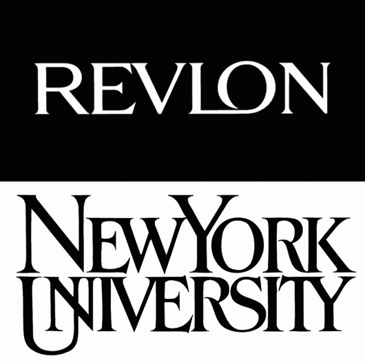
Peckolick, who grew up in New York, arose on the graphic design scene when the very concept of expressive typography was just coming into being. It wasn’t long before Peckolick was at the vanguard of the movement, designing iconic corporate logos for Revlon and New York University and partnering with design icon Herb Lubalin.
After 35 years in the game, Peckolick transitioned from graphic design to painting, still incorporating a heavy dose of type into his work. Many of his newer works depict signs as they appear not in the designer’s mind but in everyday life, weathered and bleached, occasionally sprinkled with bird droppings. Today Peckolick, who suffers from Parkinson’s disease, paints daily and occasionally takes on design projects to his liking.
Read on for a Q&A with one of typography’s living legends, as he discusses everything from growing up in the Bronx to the most overrated font there is.
To start off, can you tell me about your upbringing? Where are you from?
I’m from Mars. No. I was born in the Bronx. I came from a definitely blue collar family. My father was a letter carrier, my mother was a housewife.
A letter carrier? That’s interesting considering your future in letters.
Those don’t exist anymore. In the old days, they used to carry the mail on their backs like ponies. But there was very little culture around. I grew up with a brother and a sister. The only books you’d usually find around the house were a couple of mystery novels, science fiction novels, nothing I’d call “cultured.” So I really started off as a blank canvas or a dry sponge, however you want to put it.
Did you take art classes growing up?
Along with the blue collar family came a blue collar high school. Almost everyone I was associated with in high school was going into the military when they left or going into auto mechanics. I never knew anything about design or graphics or any of those fancy words. But, I used to draw. I used to draw everything. When my mother used to send me out to get groceries, by the time I was back there were little drawings on the grocery bags.
Growing up in New York, did you eventually explore some of the culture the city has to offer?
My mother, when I was doing the little drawings all over the place, she was smart enough to know that this kid should go to art school. One Saturday she said to me, “You’re not going to go out and play ball with your friends today. Put a tie and a shirt on and go to a museum.” I said, “What do I need to go to a museum for?” She said, “I don’t know!” So I put on a little bow tie and my bar mitzvah suit and I went in to New York, but the museum she wrote down for me was the Metropolitan Museum of Modern Art. So I spent half a day going uptown and downtown and thought, well, whatever, this is not worth it!
Basically, for me, if a word was a beautiful word, it wasn’t the sound of the word that intrigued me but the look of the word. I saw each letterform as a piece of design. Cat is not “cat” it’s c-a-t.
When did you decide to pursue art?
When it was time to go to college, my mother put together a portfolio which was made of anything I drew on — handkerchiefs, scraps, whatever — and put it literally into a brown paper bag. She sent me out into the world to go to places like Cooper Union and the School of Visual Arts who immediately saw there was no talent here and they rejected me. Finally, for some reason, Pratt Institute was willing to accept my on a trial basis. They put me in the illustration department. I remember feeling very awkward when I realized most students had gone to Music and Art, a high school in New York that I had never heard of. When I saw their portfolios I knew I was in big trouble.
Did you end up adjusting to the program?
About three months into the semester they called me into the head office and they said my work was not getting any better, I was way behind everyone else. They asked me to leave. I went down to a coffee shop they had in Pratt and I sat there very dejected. A friend came up and asked me what the problem was. I explained to him that I was kicked out of art school because I couldn’t draw very well. He said, “Well that’s no problem. Why don’t you just become a graphic designer?” I said, “What’s that?” He said, “Don’t worry about what it is, but you don’t have to know how to draw!”
So you entered into graphic design.
So I entered into graphic design, and it was almost like going into the frying pan into the fire. My first instructors were professional senior designers at places like CBS, NBC. They were talking about things I had never heard about — shape and form and letter spacing and fonts — I might as well have been in a French class. He would scream at me and tear up my assignments in front of the whole class. But then it started to change and by the time the end of the year exhibition came about half of the exhibition was my work. I don’t know if it was magic or what!
What would you say you absorbed during this time? What changed?
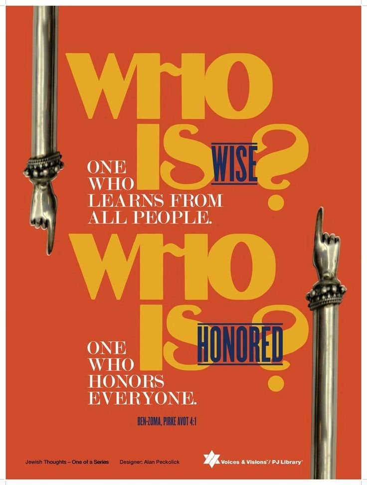
Basically, for me, if a word was a beautiful word, it wasn’t the sound of the word that intrigued me but the look of the word. I saw each letterform as a piece of design. Cat is not “cat” it’s c-a-t. That’s what led to the beginning of the expressive topography that we talk about. Letterforms themselves can support the visual idea of what the message is. You’ve got to have a love and understanding of the letterform itself before you can put this stuff together.
Was this understanding of typography just coming into the public consciousness during your first years in the business?
I was on the edge of typography. See, graphic design really comes from Europe, Switzerland was the mainstay of it. We, in the early ‘20s and ‘30s, began to start taking the design, the look, the feeling of something, and plugging it into a conceptual idea. They didn’t do that in Europe. In Europe they could do a beautiful painting or illustration but it wasn’t necessarily tied together around a certain concept. In the United States, the idea itself is the thing that you’re trying to visualize.
But before you started working in type, you worked in advertising. What was that like?
I was working as a junior designer, which was basically just following other people’s layouts. I kept getting fired from these agencies because I spent too much time worrying about what the type looked like instead of selling the soap. I didn’t care about selling the soap!
Tell me more about this soap.
The way things usually work is, you’re selling a bar of soap, so you’re getting a beautiful model and you’re getting an expensive photographer and a beautiful bathroom and on the bottom of the whole thing you have this little line of type. A lot of us designers at the time — we were kids and ego-driven — we were so concerned about that type on the bottom. We wanted to do away with that pesky image. We were rebels.
Through a bunch of icons you meet a bunch of icons, and if you’re not careful you’ll become an icon yourself.
How did you move away from the advertising world?
Just about that time I started seeing work by Herb Lubalin. He was the man who really created the movement of expressive design and conceptual design in the United States. I was very fortunate to get a job as his assistant way in the beginning of his career. That’s when I learned about type. Up until then it was like a dry desert; there was nobody there to teach me anything. Through him, I discovered other peope like Saul Bass, Lou Dorfsman, George Lois, people who could think as well as design. Then I was in the lap of luxury; I could steal from the best.
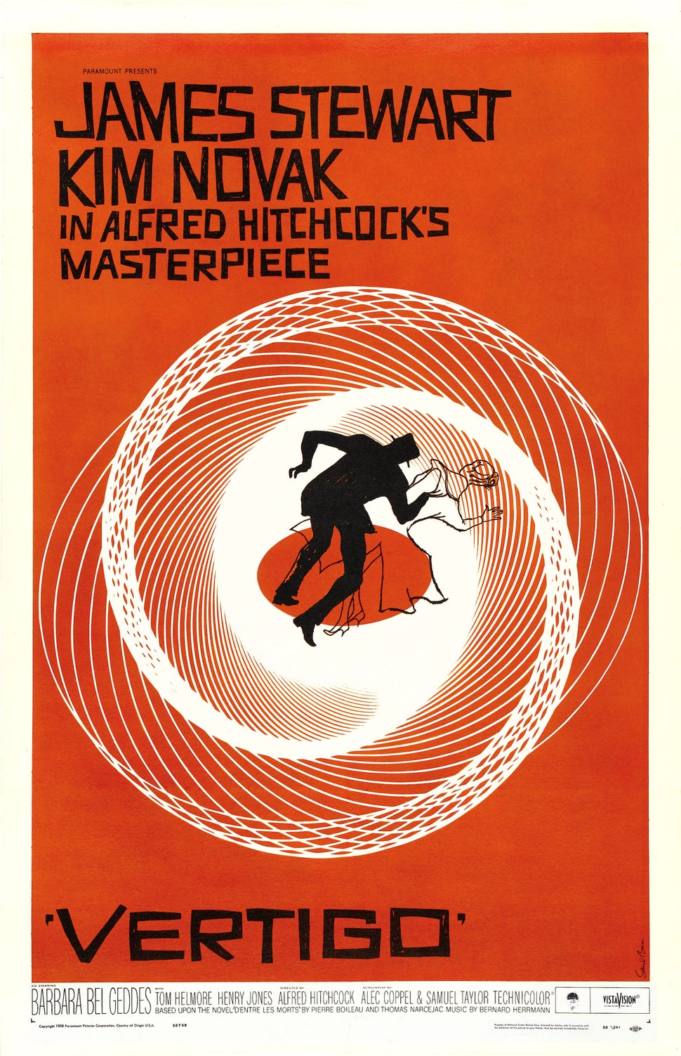
Saul Bass! What was your relationship with him like?
He and I sort of fell in love with each other on our first meeting. I had gone to see him in Los Angeles and the day our appointment was set for he was called back to New York. An associate of his said the next time Saul was in New York he would look me up and maybe we could do something. Under my breath I said, “Bulldunkers, that is never going to happen.”
A year passes and I’m still living at home with mom and dad, and my mother calls me at the office and says Saul Bass is at the Plaza Hotel in New York and he wants to see you this afternoon. I almost had a heart attack. So I ran up there and when the interview was over he offered me a job. The bad part was I was so immature and naive I didn’t have the guts to say goodbye to mom and dad and move to California.
How old were you?
I must have been 18, 19, something like that. Maturity-wise I was about 11 or 12.
Wow, that is young.
I know, but what came out of that is a lifelong friendship. And he was an icon. That’s the thing, I got lucky. Through a bunch of icons you meet a bunch of icons, and if you’re not careful you’ll become an icon yourself.
What kind of imagery did you incorporate into your letterform designs?
By loving the letterform in a naive way, not knowing why, I discovered more and more of it was coming out of different places. Not only was I starting to see things in magazines and books, I noticed signage, and I started traveling a lot, all around the world, mostly for business reasons. This gave me the opportunity to see typefaces I had never seen before — letterfaces, wood type, handdrawn type which was a thing that’s very European — it broadened my base of resources. I was surprised to find out I could alter these typefaces and from them, create my own.
Also, I think I was one of the first people who started photographing graffiti. If I liked the way a certain curve or line looked in a single letter, I would start with that and then expand.
You designed the logo for NYU. Can you walk me through that process?
The interesting thing about that is I came up with two solves for it. First, there is the New York University as you see it with all the letterforms modified. Every one of those letters is modified and does not come from a type shop. In other words no one else can use it because I created it. But in the process of creating the New York University logo you’ll see there is an emphasis on the NYU which is the way the school is spoken of. The more formal identity is the whole thing but having that NYU pop out was the cherry on top I thought. It gave me the chance to say two things at once.
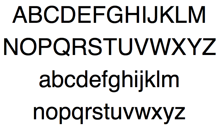
What do you think is the most overrated font?
I think the most overrated typeface in the world is Helvetica. It has no sexuality, no spirit. It just lays there on the table. I cannot believe a typeface that could be a solution to an identity for an international airline would function just as well on a cake mix box.
How did you transition into painting? Did you feel there was something missing in graphic design?
I was called on to do more teaching and more presenting and more business aspects. The companies I worked for wanted to use me as a pigeon to get new clients. I was not interested in that. What happened was, at a certain point, I got frustrated. These demands were made on me that took away from creative time. At one point, I decided subconsciously that I was going to make a move. I stopped meeting deadlines, I stopped returning calls to clients. In other words, I was cutting my own throat on purpose. One day I did the ultimate sin, I actually took the afternoon off and went to a movie. When I went out of the theater I happened to be standing in front of an art supply store. I thought I’ve never painted before, I’ve never held a paintbrush in my hand. Let’s start something fresh.
Even if I’m scared as hell, I’m never bored. Life is too short to spend my time doing boring things.
What were some of the challenges of painting that you didn’t have to deal with in graphic design?
The biggest difference I find, and a very difficult difference it is, is when you are working for a graphic design client you are solving the client’s problem. When you are a fine artist you have to come up with the problem and the solution. When I started, there was nothing more frightening than looking at a blank canvas.
Is it easier for you to look at a blank canvas now?
No. There’s just a broader range of aggravations.
So what are some of the potential problems you are trying to solve through your paintings?
The simplest thing is: what do you want to paint? I read stories and plays about the starving young artist who wants to send the world a message. I don’t have a message for anybody except I want to keep busy and not go nuts.
Are there any particular visual artists who’ve inspired you?
I’m definitely an Edward Hopper man, there is no two ways about it.
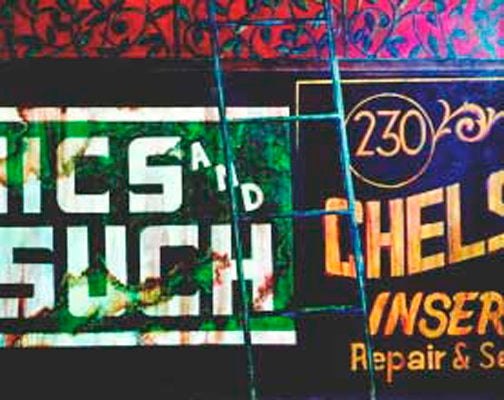
How is the world different today for a budding typographer than when you were entering the field?
When I started there was very limited availability of new, good, fresh typefaces. There were only the old classics. One of the problems with typography is that when I got into the business type was still hot lead, which means each character was its own piece of lead, and they couldn’t be letter spaced or word spaced. You were really locked in. At the same time that I was entering the business the technology was changing, so you could overlap letters, make ligatures, all these things. It opened up a whole world, all these new possibilities.
Are there any downsides, in your opinion, that come with the technological advancements?
They’re all relying too much on the computer. I think the computer is a brilliant electric pencil. But it can’t think. The way I work is, you gotta think first, you gotta solve the problem in your own head, then you scribble it out on paper and see if it’s gonna function graphically. Then you go to the computer.
Do you use a computer now or do you still hand letter?
I still draw all my letters with a pen and paper. I’ve never used a computer. I still can’t even get my email!
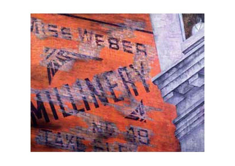
How has living with Parkinson’s affected your ability to make art?
Parkinson’s is interesting. It’s a hard disease but I always say to people, if it really gets bad I can become an abstract painter.
Has art making provided any healing or therapeutic benefits for you?
Yes, it does. The passion is still there. I never get up and sit down in front of a blank pad, I’m never bored. Even if I’m scared as hell, I’m never bored. Life is too short to spend my time doing boring things.
Do you have any advice for aspiring typographers trying to break into the field?
Think, think, think. The only thing that should come before design is think.
This article originally appeared in the Huffington Post.


