


Stop Art-Thieves by Freestylee – Artist Without Borders

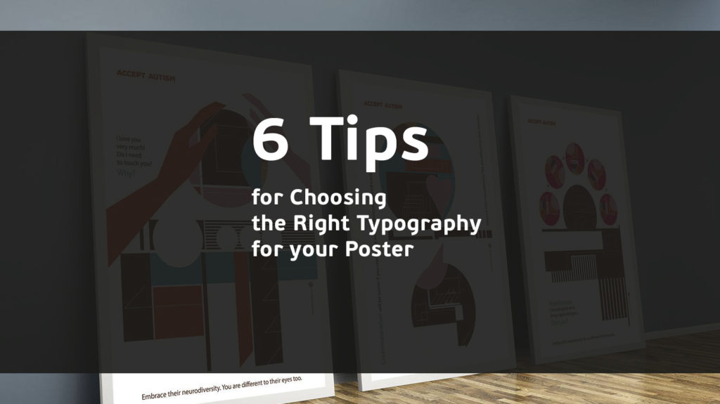
Accept Autism – by Maria Papaefstathiou aka It’s Just Me
Never use more than three different kinds of type
A good designer is always aware of the visual hierarchy (the order in which you prioritise your content) and how to use it to avoid confusing the person engaging with your content. One of the key ways to avoid this problem when designing a poster is by never using more than three different typefaces. The wider the variety of type, the harder it gets for your reader to focus on the content, so be sure to keep this tip in mind to prevent this problem from arising.

Don’t forget about the typeface weight
The weight of a typeface – the width of the stokes that make up each letter – is an important factor that many designers are aware of, even if it’s only on a subconscious level. However, it’s a vital factor in the visual hierarchy. Choosing the right weight of font can draw the viewer’s eye, focusing their attention on a specific word or phrase that you want them to prioritise. You can clearly see this demonstrated when you choose a different style of font, such as light, normal or bold, or when applying a different font setting, such as italics.
While you may be tempted to use the same font to communicate the importance of all of your written content, don’t forget that this can make your piece monotonous and have the opposite effect that you intended. Prioritisation of the different key points of your poster can be introduced by using variety.

Nelson Mandela by Maria Papaefstathiou aka It’s Just Me
Key information should be eye-catching and easily visible from a distance
Another factor you need to be aware of is the clarity of your type at a distance. Most people are going to be walking (or driving) along, going about their own business. The first thing is to choose typography that grabs their attention away from whatever they are doing – not an easy task since they may be focused on their plans for the day or their mobile phones.
Once you have successfully grabbed their attention, the poster font needs to be large enough that the key information can be taken in without the reader having to get close to the poster. It’s recommended that vital text on your poster be legible from about five feet away.

AFRICAN-MIGRANTS by Michael Thompson aka Freestylee – Artist Without Borders
Kerning is key
When selecting a typeface, there are different elements you should be aware of to ensure it’s clearly legible including:
- the shape of each letter, number and symbol
- the kerning, or letter spacing
By paying attention to these factors, you can avoid many fonts that may appear perfect at first glance, only for you to discover later that specific characters (often lowercase letters like g, j, p or y) simply do not read clearly.

Face Africa by Michael Thompson aka Freestylee – Artist Without Borders
Picking the perfect partner
When working with different kinds of type on a poster, you’re going to need to introduce some variety by making use of more than one font (up to a maximum of three). However, not all fonts work well together and some might even clash and disrupt the reading experience. Keep in mind the following when attempting to pair two fonts that contrast and create visual interest:
- Sans serif usually work well with certain serif fonts (feel free to experiment)
- Classic and contemporary fonts usually complement each other
- Regular fonts should be paired with bold fonts
- Short fonts work well with tall fonts
- Heavy fonts and lighter fonts create a good visual balance
- Regular style fonts gel well with italics style fonts
Choosing the right typography for your poster can be difficult, but hopefully, these few tips will help you create more visually interesting messages that clearly get the point across.
This post originally appeared in Graphic Arts News.